
 TD
TD
Key Takeaways
- Two columns are not automatically fatal - what fails is how the columns are constructed.
- True text columns and table-based layouts parse very differently from side-by-side text boxes.
- The dangerous pattern is splitting one continuous section across two columns.
- A sidebar holding only self-contained items is lower risk than a full two-column body.
- The copy-paste test settles it for your specific file in thirty seconds.
"Never use two columns" is the standard advice. It is roughly right and badly explained, which leads people to abandon layouts that would have been fine and keep ones that are not.
What matters is not the number of columns. It is whether the parser can reconstruct which text belongs to which section.
How the Failure Happens
A parser converts your PDF into a linear stream of text. A PDF stores positioned characters, not a layout description - so reconstruction involves guessing reading order from coordinates.
With one column, the guess is easy: top to bottom. With two, the parser must decide whether to read down the left column then down the right, or across each horizontal band.
Read across when it should have read down, and you get this:
Senior Analyst SQL, Python Acme Corp Tableau, dbt 2022-2025 Snowflake - Rebuilt reporting AWS, Git
Every line now contains fragments of two unrelated sections. Your employment history is unreadable, and your skills are scattered through it.
Why the guess is not deterministic
Two PDFs that look identical on screen can carry completely different internal structures depending on which tool exported them.
That is why no general rule about columns holds for every file, and why the only reliable answer comes from testing your own document rather than reasoning about the category. The same uncertainty explains why two checkers disagree about the same resume.
Three Ways Columns Get Built
1. Two text boxes side by side. Highest risk. Common in design-tool templates. Each box is a separate object and content may be read in creation order, or one box skipped entirely.
2. A two-column table. Medium risk. More parsers handle tables now, but behaviour varies - some read cell by cell correctly, some flatten row-first and interleave everything.
3. True text columns. Lower risk. The document format records these as a continuous flow, so reading order is more often preserved.
You usually cannot tell which you have by looking. The copy-paste test tells you in seconds.
Identifying which one you have
If you built the document yourself, the construction method is whatever you used: a "columns" menu command gives true text columns, an inserted table gives a table, and dragging boxes onto a canvas gives text boxes.
If you downloaded a template, assume text boxes until proven otherwise - that is how most visual templates are assembled, and it is the highest-risk option. Choosing a template is largely a question of what it is built from rather than how it looks.
The Risk Table
| Layout element | Construction | Risk | What typically happens |
|---|---|---|---|
| Full two-column body | Side-by-side text boxes | Critical | Sections interleave or vanish |
| Full two-column body | Two-column table | High | Row-first flattening scrambles both |
| Full two-column body | True text columns | Medium | Usually survives, sometimes reorders |
| Narrow skills sidebar | Text box | Medium | Skills list may be dropped entirely |
| Narrow skills sidebar | Table cell | Medium | Usually arrives, order may shift |
| Contact details in sidebar | Any | High | Phone and email frequently lost |
| Contact details in page header | Any | Critical | Very often not extracted at all |
| Experience spanning columns | Any | Critical | Dates attach to the wrong roles |
| Dates in a right-hand column | Table or tab stop | High | Dates detach from their jobs |
| Skills as a horizontal line | Body text | None | Parses cleanly every time |
| Icons beside contact details | Image glyphs | Low-medium | Icons ignored, text usually fine |
| Section headings in a sidebar | Text box | High | Headings lost, content unclassified |
The pattern: risk tracks how much the content depends on association. Self-contained items survive reordering; anything whose meaning comes from what it sits next to does not.
The Distinction That Decides It
Whether a column layout survives depends less on the mechanism than on what you put in it.
Lower risk - self-contained items in a sidebar:
Contact details Skills list Languages Certifications
Each item is short, independent, and still meaningful if the order shifts. Skills arriving as a jumbled list are still a recognisable skills list.
Higher risk - a section split across columns:
Your work history in the left column, continuing into the right
Employment history depends on association - this title belongs to this employer with these dates and these bullets. Break that and the information is not merely untidy, it is wrong. A parser may attach your 2019 dates to your current job.
The rule: never let your experience section span columns. If a sidebar holds only self-contained blocks, the risk is manageable.
Why association is the deciding property
A skills list is a set. Shuffle it and it is still the same set, so a parsing error costs you nothing.
Your employment history is a set of relationships. "Senior Analyst" means nothing without "Acme Corp" and "2022-2025" attached to it, and a parser that breaks those links does not merely disorder your resume - it produces false statements about your career. That is why a job can silently disappear without anything appearing wrong on the page.
When a Two-Column Resume Is Reasonable
- You are in a design field where the document doubles as a work sample
- You are applying directly to small companies without an ATS
- Your sidebar contains only contact details, skills and short lists
- You have run the copy-paste test on your actual file and it comes back clean
When to Use One Column
- You are applying at volume through job portals
- You are applying to large employers, who almost all use parsing systems
- Your experience section spans both columns
- Your paste test comes back scrambled
- You are unsure - single column costs you nothing
That last point deserves weight. A well-designed single-column resume looks entirely professional. The visual gain from two columns is small; the downside risk is your employment history arriving as nonsense.
The asymmetry that settles most cases
The upside of two columns is fitting perhaps 15% more on the page and a slightly more designed appearance.
The downside is a parsing failure you cannot see, on an application you will never get feedback on. Because the cost is invisible and the benefit is cosmetic, the decision is easier than it looks - and it is the same reasoning behind most ATS formatting choices.
The asymmetry is sharper than it first appears because the two outcomes are not comparable in kind. A slightly denser page is a marginal gain on every application. A scrambled employment history is a total loss on the applications where it happens, and you cannot tell which those were.
Decisions with invisible downside risk deserve the conservative default, and that is the honest argument for single column - not that two columns always break, but that you will never find out when they did. The same logic governs file format choices, where the safe option costs nothing and the risky one fails silently.
Getting the Space Back
Most people use two columns to fit more on the page. Single-column alternatives that recover the same space:
A horizontal skills line. SQL · Python · dbt · Snowflake · Tableau · Git - one line, fully parseable.
Grouped skills on two or three lines. Technical, analytical, tools - each on its own line, no columns.
Tighter margins and line spacing. Reducing margins to around 1.5cm and spacing to 1.05 recovers more room than a sidebar, with no parsing risk.
Cutting content. Usually the real answer. Most resumes needing two columns are carrying older roles that could be compressed to one line each.
What to cut first
Older roles compress to one line each - title, employer, dates, no bullets. Ten-year-old work is context, not evidence.
After that, remove bullets describing duties rather than outcomes; they take space and persuade nobody, and weak bullets behind a good score are the most common filler on a crowded page. Between those two passes, most two-column resumes become comfortable single-column ones.
A Second Example: The Designer's Dilemma
The general advice assumes the document is only a document. For designers, architects and some marketers, the resume is partly a work sample, and single-column plainness genuinely costs something.
The resolution is two files rather than one compromise.
Version A - the application file. Single column, plain body text, conventional headings. This is what goes into every portal and every ATS.
Version B - the portfolio file. Whatever you like. Two columns, colour, type. This goes to a named person by email, or lives as a link in Version A.
A designer sending Version A has not undersold themselves, because Version A contains a link to the work. A designer sending only Version B has gambled their employment history on a parser's reading-order heuristic.
If you would rather the portfolio version be a page than a PDF, a portfolio site gives you the visual freedom without asking the resume to carry it.
Checking Your Own File
Copy-paste your PDF into a plain text editor and look for:
- Skills interleaved with job titles
- Any section that vanished
- Dates detached from the roles they belong to
- Lines mixing content from both columns
If your experience section reads top to bottom with each job's details attached correctly, your layout is surviving - regardless of how many columns it appears to have.
Reading the result properly
The output will be ugly. That is expected and not a failure signal - plain text has no formatting by definition.
What you are checking is structural: is every section present, is every date attached to its role, and does the experience section read in order. The full diagnostic is in the copy-paste test, including what each specific failure pattern means.
Edge Cases
The template is advertised as "ATS-friendly"
That is a marketing claim, not a verified property, and it is frequently applied to two-column designs that scramble.
Test the exported file. The label tells you what the vendor believes; the paste tells you what happens. This is one of the more durable ATS myths - that a template can be certified safe independently of how it is built and exported.
Your sidebar holds only an icon-based contact block
Icons themselves are ignored, which is fine. The risk is the text beside them, and contact details are the single most commonly lost element on a resume.
Put your name, email and phone in the document body regardless of what the sidebar does - contact section parsing failures are how people become unreachable without knowing it.
You are applying in a country where photo-and-sidebar layouts are standard
Regional conventions are real, and in several markets a structured two-column CV is expected. The parsing risk does not change with geography, but the trade-off does.
Where the convention is strong, use a conservative two-column build - true text columns, experience never spanning - and test it. Country-level differences are covered in the relevant format guides.
It has worked for years and you get interviews
Possibly it parses fine, or possibly you have been succeeding despite losing some applications invisibly. You cannot distinguish these from the outside.
The test costs thirty seconds and removes the question permanently.
What This Looks Like at Each Level
Fresher. A two-column layout is often used to fill a page that does not have enough content yet. Single column with a projects section is both safer and a better use of the space.
Two to five years. This is where the page genuinely gets crowded and the sidebar becomes tempting. Compress older roles instead.
Senior. Two pages are acceptable and expected, which removes most of the reason to use columns. A senior resume forced into one column across two pages parses reliably and reads well.
Career changer. Your history needs explaining rather than compressing, so structural clarity matters more than density. Single column, with the relevant evidence surfaced early - the reordering that puts transferable work first matters far more here than the column count.
Frequently Asked Questions
Will a two-column resume be automatically rejected?
No. It risks being parsed incorrectly, which usually means a lower ranking rather than rejection. The practical effect on a competitive posting can be similar.
Are the two-column templates in resume builders safe?
It depends entirely on construction. Test the exported file rather than trusting the label - "ATS-friendly" is a marketing claim, not a verified property.
What about a narrow sidebar for contact details only?
Lower risk than a full second column, though header and sidebar placement of contact details is still where parsing most often loses a phone number. Body placement is safest.
Does .docx parse better than PDF for columns?
Sometimes, because the format records structure explicitly. But a .docx with side-by-side text boxes can fail the same way.
I have used a two-column resume for years and had interviews. Is it fine?
Possibly - or you succeeded despite it. The test costs thirty seconds and removes the uncertainty.
Can I keep two columns if I only put skills in the sidebar?
Usually yes, provided the sidebar is genuinely self-contained and your experience section is single column. Test it anyway.
Does the number of columns affect my score directly?
Not as a rule the scanner applies. It affects the score indirectly, by changing what text arrives and whether your sections are correctly identified.
What if the parser reads my columns correctly?
Then the layout is fine for that parser. You cannot verify this for every employer, which is the argument for the conservative default when you are applying at volume.
Should I convert an existing two-column resume or rebuild it?
Rebuild the experience section as plain body text rather than converting. Converted tables and text boxes often retain the underlying structure that caused the problem, so the paste still scrambles even though the page now looks like a single column. Retyping the section takes ten minutes and removes the ambiguity, and the parsing failures that delete a job are worth ruling out while you are in there.
Is one column really not worse to look at?
Well-set single-column resumes look entirely professional - typography, spacing and hierarchy do the work that columns were doing. Margins and spacing matter more to the finished impression than the column count does.
Test Yours, Then Check Relevance
Structure first: run the paste test and confirm your experience section arrives intact. That is the problem no keyword work can fix, because the words never arrive to be counted.
Once it is clean, scan your resume against a posting to see how your wording matches - the question that only becomes meaningful once the document is being read correctly.
If the scan comes back missing terms you know you cover, that is usually a parsing problem rather than a vocabulary one, and it points straight back to the layout.
Related: the copy-paste test in detail and why headers and footers vanish in parsing.
What is your resume scoring right now?
Scan it against a job description and get your ATS match score in about a minute.
Drop your resume here or choose a file
PDF only. Max 2 MB.
We never share your data or use it to train AI models.
Templates that keep this structure intact
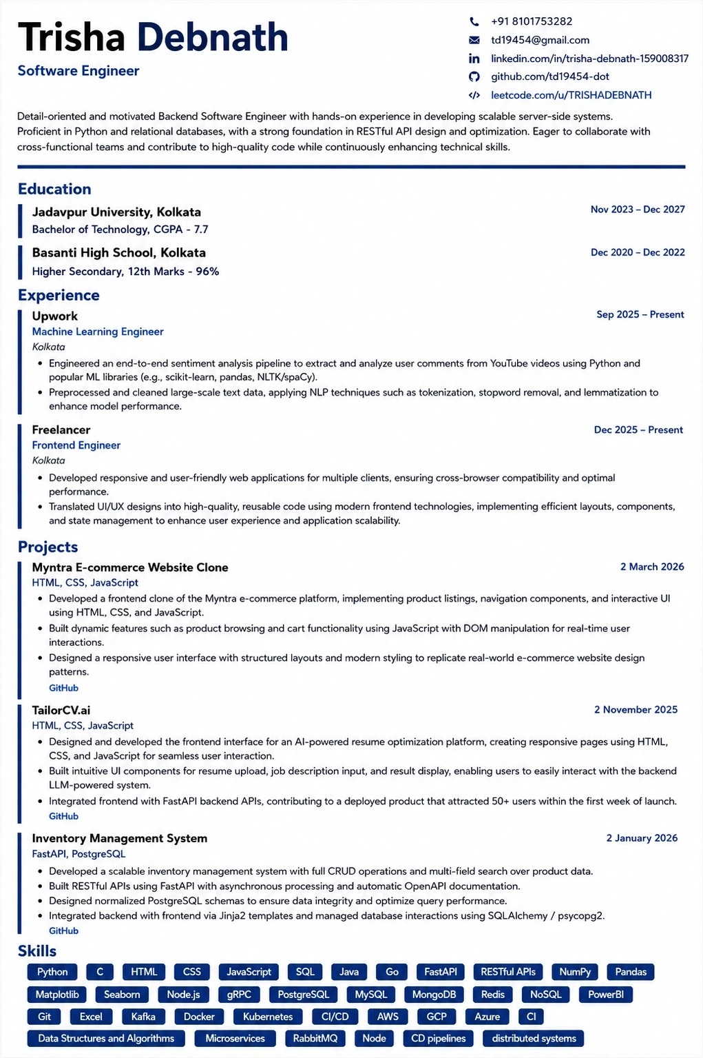
This template is ATS-tested — start from it and the formatting rules in this guide are already handled.
Was this guide useful?
Be the first to rate it.