 SS
SS
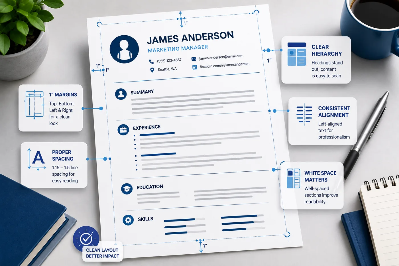
Resume formatting is not glamorous - but it is the difference between a resume that gets read and one that gets skipped. Correct margins, spacing, and layout create a document that looks professional, scans easily for recruiters, and parses correctly for ATS systems.
This guide covers the exact measurements and formatting rules for a polished, readable resume in 2026.
Start from an ATS-friendly template that has these settings pre-configured, then use this guide to understand and adjust them. Check your final resume with the TailorCV ATS score checker.
Key Takeaways
- Use standard margins of 0.75-1 inch for a professional appearance; avoid going below 0.5 inch to maintain readability.
- Line spacing should be set between 1.0-1.15 for paragraphs and bullets, with 6-12pt space between sections for clarity.
- Utilize white space effectively to enhance document scan-ability and prevent a cluttered look.
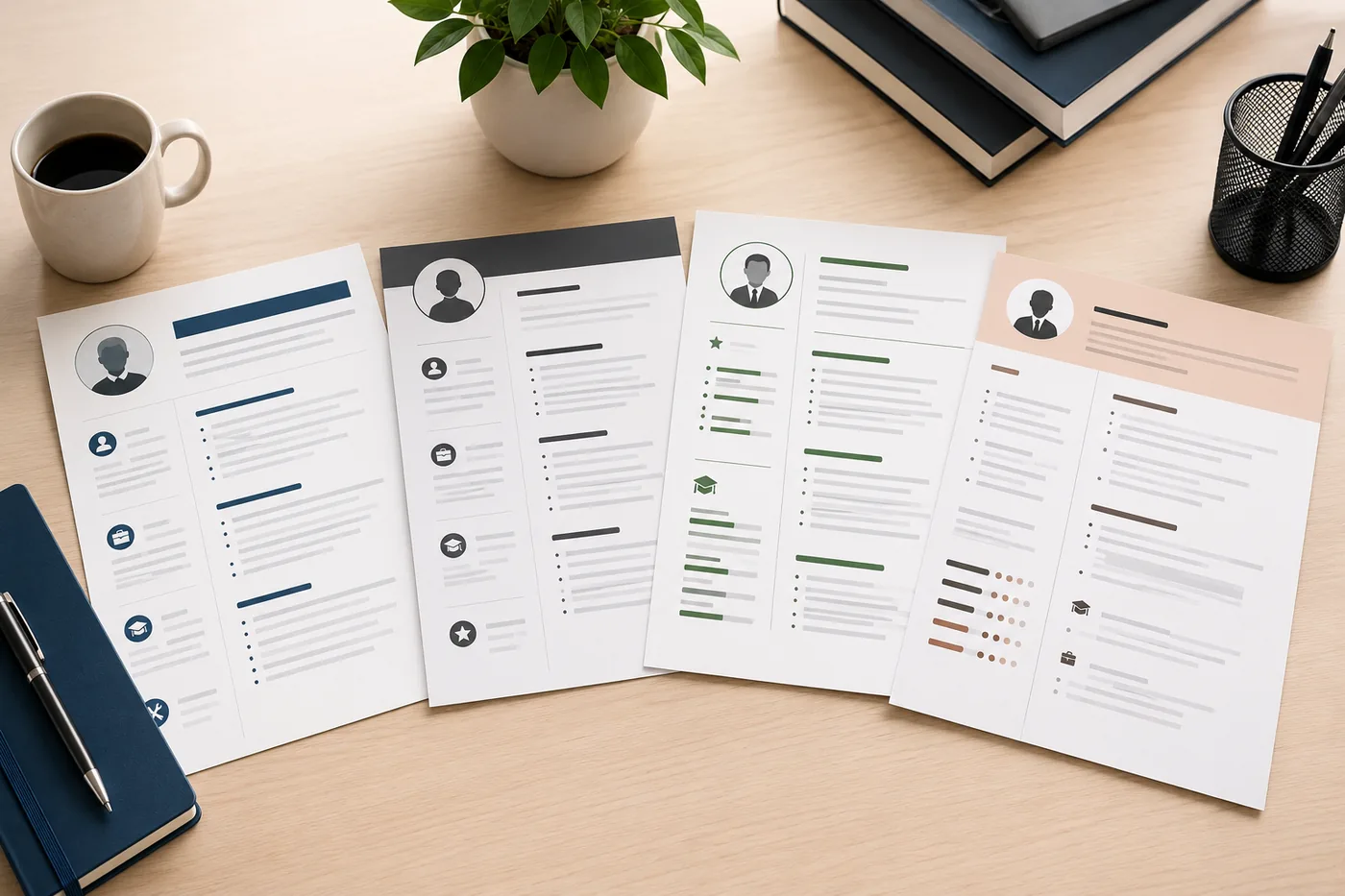
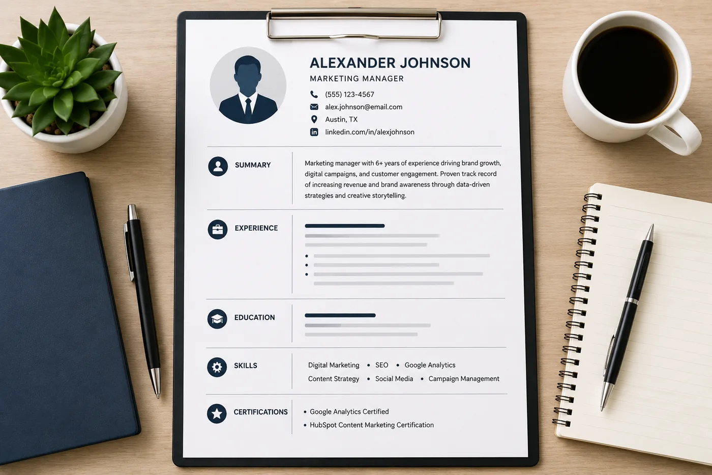
- A single-column layout is recommended for ATS compatibility and recruiter preference, while two-column formats should generally be avoided.
Resume Margins: The Exact Numbers
Standard Margins (Recommended)
- Top and bottom: 0.75-1 inch
- Left and right: 0.75-1 inch
This creates a balanced, professional-looking document with adequate breathing room.
Minimum Acceptable Margins
- Top, bottom, left, right: 0.5 inch minimum
Do not go below 0.5 inch on any side. Margins smaller than this make the resume look cramped, reduce readability, and can clip text during printing or PDF conversion.
When to Use Tighter Margins (0.5-0.75 inch)
Only if you genuinely have more high-value content than fits at 1 inch margins. Do not tighten margins to avoid trimming mediocre content - cut the content instead. Read what not to put on a resume for what to remove.
When to Use Wider Margins (1 inch)
When you have less content - for instance, a fresher or early-career candidate. Wider margins keep the resume from looking sparse while maintaining a professional appearance.
Line Spacing: Readability Rules
Between Lines in Paragraphs and Bullets
- Recommended: 1.0-1.15
- Acceptable: Up to 1.2
Single spacing (1.0) is the standard for bullet points and text lines. Line spacing above 1.2 wastes space and can push content to a second page unnecessarily.
Between Sections
Add 6-12pt of space between sections (before each section header). This creates clear visual breaks without the cost of a full blank line.
After Section Headers
Add 2-4pt of space after a section header before the first item under it. This creates hierarchy between the header and content.
White Space: The Underrated Element
White space is the empty space on your resume. Used correctly, it: - Makes the document easier to scan - Prevents the overwhelmed feeling of a wall-of-text resume - Creates visual separation between sections - Signals organization and professionalism
White space rules: - Never fill every inch of white space just to look "full" - Let bullet points breathe - do not stack 8+ bullets without visual breaks - Use consistent spacing between every section - Maintain equal margins on all sides
A clean, well-spaced one-page resume is vastly preferable to a cramped two-page resume. Read the ideal resume length guide for the right decision.
Single Column vs Two Column Layout
Single Column: Strongly Recommended
A single-column layout is: - ATS-compatible: ATS reads left to right, top to bottom. Single column parses reliably. - Recruiter-preferred: The natural scan pattern recruiters use is a top-to-bottom F-shape - single column supports this perfectly. - Printer-friendly: No alignment issues across pages
Two Column: Avoid for Most Uses
Two-column resumes look visually appealing but have serious drawbacks: - ATS failure: Many ATS systems read two-column resumes incorrectly, mixing content from both columns, losing information, or scrambling your experience data - Scan issues: The right column is often skipped in the recruiter's first scan - Mobile readability: Two columns are difficult to read on phones
This is one of the most common ATS resume formatting mistakes. Read 10 ATS resume formatting mistakes for the full list.
Exception: If you are submitting directly to a human (not through ATS) and design matters for your industry (graphic design, UX, creative), a two-column layout can work. For all other cases, stick to single column.
Section Spacing Hierarchy
Create visual hierarchy through consistent spacing:
- Resume name - Largest text on the page (18-24pt), followed by contact info
- Section headers - Bold, consistent size (12-14pt or same as body, bold), with clear space above and below
- Role headers (Company | Title | Dates) - Bold for title, consistent formatting
- bullet points - Consistent indent, consistent style, 1.0 line spacing
- Sub-bullets (if needed) - Use sparingly, further indented
Never mix indentation styles or spacing patterns within the same section.
Consistent Formatting Rules
The biggest formatting mistake is inconsistency. Small inconsistencies signal carelessness to recruiters and can confuse ATS parsing.
Dates: Use the same format throughout. - Correct: "Jan 2021 - Mar 2023" or "January 2021 - March 2023" or "01/2021 - 03/2023" - Wrong: mixing formats in the same document
Bullets: Use the same bullet style throughout (-, -, or plain dash). Do not mix bullets and circles.
Bold and italics: Use consistently - e.g., company name always bold, role always italic, or always the reverse. Pick one system and stick to it.
Alignment: Left-align all text. Dates can be right-aligned if your template uses that style, but it must be consistent for every role.
Resume Layout Checklist
Before submitting your resume, verify:
- [ ] Margins are 0.5-1 inch on all sides
- [ ] Body font is 10-11pt (never below 10pt)
- [ ] Line spacing is 1.0-1.15
- [ ] Single-column layout
- [ ] Consistent date formatting throughout
- [ ] Consistent bullet style throughout
- [ ] Clear space between sections
- [ ] No decorative boxes, tables, or graphics
- [ ] Headers use standard names (Experience, Education, Skills)
After completing this checklist, run your resume through the TailorCV ATS checker to verify parsing. Use ATS-friendly templates to start with all these settings pre-applied.
Common Formatting Mistakes
Mistake 1: Shrinking font to force one page
Going below 10pt font to squeeze content is always wrong. Cut the content instead.
Mistake 2: Cramped or missing margins
Resumes with less than 0.5 inch margins look unprofessional and are harder to read.
Mistake 3: Decorative tables, boxes, and lines
Graphics and tables are invisible to ATS. They confuse parsing and look unnecessary. Use plain text and spacing instead.
Mistake 4: Inconsistent formatting
Different date formats, mixed bullet types, varying spacing - all signal a lack of attention to detail.
Mistake 5: Two-column layout
The ATS and recruiter scan pattern issues with two-column layouts make them a risky choice in most applications.
Related Guides
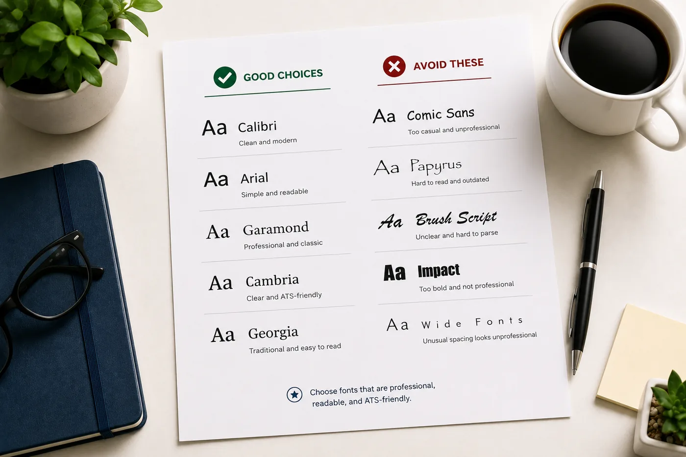
- Best Resume Fonts for 2026
- Resume Design and Color Guide
- ATS Resume Formatting Mistakes
- How to Make Your Resume ATS-Friendly
- Ideal Resume Length Guide
- How Recruiters Read Resumes in Under 10 Seconds
- How to Choose the Right Resume Template
- Resume Proofreading Checklist
- What Not to Put on a Resume
Make This Practical
Use this guide as part of a complete job-search workflow. Check your resume with the free ATS score checker, improve targeting with the Resume Optimization Guide, and choose a clean format from the ATS-friendly resume templates.
After the resume is ready, strengthen the rest of the application. Draft a targeted letter with the AI cover letter generator, practice interviews with the AI mock interview tool, and create a project-backed proof page with the portfolio website builder if you need a stronger online presence.
Conclusion
Standard resume formatting in 2026: 0.75-1 inch margins, 1.0-1.15 line spacing, single-column layout, 10-11pt body font. Consistency across every element - dates, bullets, bold usage - signals professionalism and ensures ATS can parse your document correctly.
The fastest path to perfect formatting is starting from an ATS-friendly template that has all these settings correct by default. Then verify with the TailorCV ATS checker before every application.
Frequently Asked Questions
What are the recommended margins for a resume in 2026?
The recommended margins for a professional resume in 2026 are between 0.75 to 1 inch on the top, bottom, left, and right sides. This range provides a balanced look while ensuring adequate white space, which enhances readability. If you need to tighten margins due to content constraints, ensure that you do not go below 0.5 inches, as smaller margins can make your resume appear cramped. For tips on selecting the right resume template that accommodates these margins, check our guide.
How should I format line spacing in my resume?
For optimal readability, it is recommended to use line spacing between 1.0 and 1.15 for paragraphs and bullet points in your resume. This spacing helps to clearly separate different sections and makes it easier for recruiters to scan your document. If you are unsure about how to structure your entire resume, refer to our detailed guide on the anatomy of a perfect resume.
What is the importance of white space in a resume layout?
White space is crucial in a resume layout as it enhances readability and allows the content to breathe. Proper use of white space can guide the reader's eye and make your resume appear more organized and professional. To learn more about how to effectively use design elements like white space, refer to our resume design and color guide.
Can I use tighter margins to fit more information on my resume?
While it might be tempting to use tighter margins to include more content, it's essential to maintain a minimum margin of 0.5 inches. If you have high-value content that exceeds the space available, consider editing out less relevant information instead of cramming everything in. For insights on what to keep or remove, read our article on what not to put on a resume.
How can I check if my resume is ATS-friendly?
To ensure your resume is ATS-compatible, you can use the free ATS score checker available on our website. This tool evaluates your document's formatting and content to help you identify any issues that could prevent it from being parsed correctly by applicant tracking systems. For more details on common mistakes that could lead to rejection, check out our list of 10 ATS resume formatting mistakes.