 SS
SS
Should your resume be black and white or colorful? Simple or designed? The honest answer: it depends on your industry - but in almost every case, the simpler and more ATS-compatible your design, the better your chances of getting through the process.
This guide breaks down exactly when and how to use color and design elements on a resume, what looks professional versus gimmicky, and how to balance visual appeal with ATS compatibility.
Start with an ATS-friendly template that has the right design baked in. Test your resume with the TailorCV ATS checker to confirm your design choices are not breaking parsing.
Key Takeaways
- The effectiveness of resume design and color largely depends on the industry; simpler, ATS-compatible designs generally perform better.
- Prioritize substance over style; a well-written, keyword-optimized resume is more valuable than a visually appealing one that fails ATS.
- Use minimal and strategic color to enhance visual hierarchy, but avoid bright or multiple colors that can distract from content.
- Creative industries can afford more design latitude, but resumes must remain legible and professional while being ATS-compatible.
- Conservative industries prefer clean, black-and-white resumes, as excessive design may signal a lack of cultural awareness.
The Core Rule: Substance Over Style
A beautifully designed resume that fails ATS is worthless. A plain but well-written, keyword-optimized resume that passes ATS and earns a 30-second read from a recruiter will always outperform it.
Design is secondary to: 1. Keywords and ATS score 2. Quantified achievements 3. Clean, scannable structure 4. Tailoring to the specific role
Design is an enhancement, not a substitute. Read how recruiters read resumes in under 10 seconds - they are scanning for content, not admiring layout.
Should You Use Color on Your Resume?
Most Cases: Minimal, Strategic Color Is Fine
A completely black-and-white resume is professional in every industry. But a subtle use of color - primarily for section headers or your name - can improve visual hierarchy and make key sections easier to find during the recruiter's scan.
Color use that works: - A single accent color for section headings - Your name in a deep navy, dark teal, or charcoal - Thin horizontal rules in a muted accent color - Subtle color in a header bar (very light background or colored name block)
Color use that backfires: - Bright, loud colors (red, orange, yellow, hot pink) - Multiple accent colors throughout - Colored body text (beyond a single accent) - Heavy color blocks that distract from content
Creative Industries: More Design Latitude
Graphic designers, UX designers, art directors, brand designers, and some marketing roles can justify more design investment on a resume - it is a portfolio signal in itself.
But even here, the resume still needs to be legible, professional, and ideally ATS-compatible (or you submit a plain version to ATS and a designed version in person or to human contacts).
Corporate, Finance, Law, Government: Minimal or None
In conservative industries, visual design on a resume can work against you. A clean, black-and-white resume signals the professional seriousness these industries expect. A colorful, heavily designed resume may signal misaligned cultural awareness.
Best Colors for a Resume
| Color | Impression | Best For |
|---|---|---|
| Navy blue | Professional, trustworthy | Finance, consulting, business |
| Dark teal | Modern, professional | Tech, marketing, operations |
| Charcoal / dark gray | Clean, neutral, modern | Almost any industry |
| Muted forest green | Fresh, approachable | Healthcare, education, non-profit |
| Burgundy | Sophisticated, distinctive | Law, consulting, executive roles |
| Black (only) | Classic, authoritative | Any industry |
Colors to Avoid
- Bright red (aggressive, alarming)
- Bright orange or yellow (low contrast, unprofessional)
- Pink (too informal for most industries)
- Multiple colors that do not form a coherent palette
Design Elements: What Works and What to Avoid
Works Well
Thin divider lines between sections
Single, thin horizontal lines separating sections are clean and widely supported by ATS.
Bold section headers
Using bold (with or without a subtle color) for section headers (Experience, Education, Skills) helps the recruiter's eye find sections quickly.
Consistent icon usage (minimal)
Small, standard icons next to contact info (phone, email, LinkedIn) can look clean in modern templates. However, icons embedded as images may not render in ATS - test this with the ATS checker.
Header band (subtle)
A subtle header band or bar at the top of the page with your name and contact info can look professional when the colors are muted and the text is still readable.
Avoid
Graphics, charts, and infographics
Skill bars ("Python: 90%"), pie charts for skills, and infographic-style design elements all have the same problem: ATS cannot read them and recruiters rarely trust them. A skill bar showing "90% Python" means nothing - what does 90% mean? Show Python experience in bullet points instead.
Tables for work experience or skills
Tables are poorly supported by many ATS systems. If your resume uses a table for its layout, the entire structure can collapse. Use standard paragraphs and bullet points.
Text boxes
Text in boxes is often invisible to ATS. Never put your contact info, summary, or work experience inside a text box.
Two-column layout
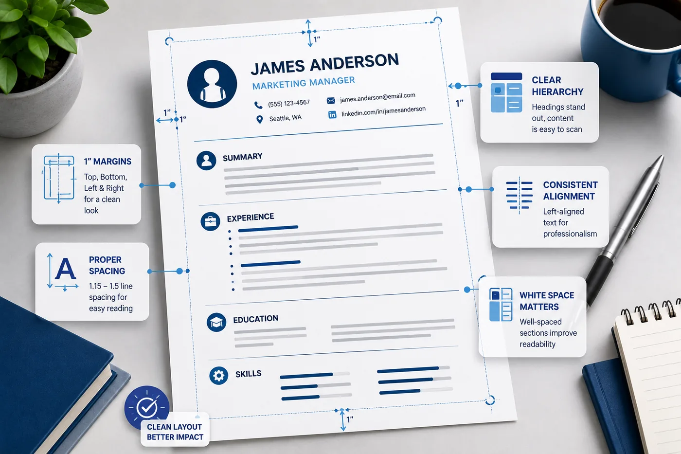
Two-column designs cause ATS parsing errors and break the recruiter scan pattern. Use single column. Read resume margins, spacing and layout.
Background shading behind body text
Background colors behind your experience sections can make text difficult to read and may export poorly to PDF.
Design by Industry: Quick Reference
| Industry | Design Level | Color | Two Column? |
|---|---|---|---|
| Software Engineering | Minimal-Modern | Dark accent OK | No |
| Data Science | Minimal | Dark accent OK | No |
| Finance/Banking | Minimal | None or subtle | No |
| Consulting | Minimal-Clean | None or subtle | No |
| Marketing | Moderate | 1-2 colors OK | No (ATS risk) |
| Graphic Design | Creative | Bold colors OK | Only for portfolio, not ATS submissions |
| UX/Product Design | Moderate-Creative | 1-2 colors OK | No (ATS risk) |
| Healthcare | Clean, minimal | None or very subtle | No |
| Law | Minimal, classic | None or dark gray | No |
| Government | Minimal | None | No |
| Education | Clean | Very subtle | No |
The ATS Design Test
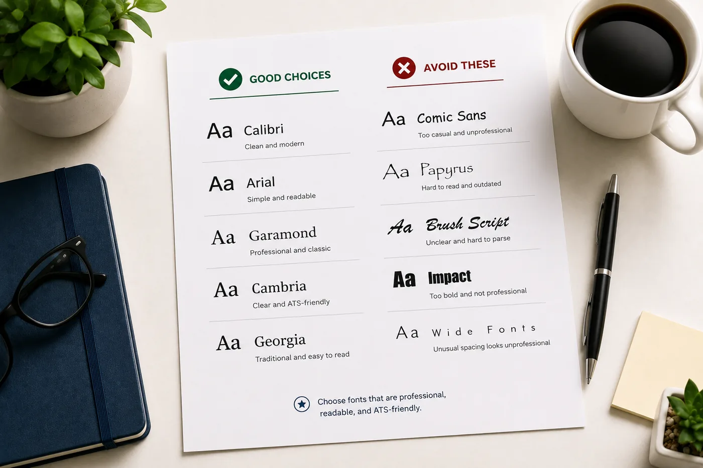
No matter how visually impressive your resume looks, it must pass ATS. The safest design choices: - Single column - No tables or text boxes - No graphics, skill charts, or icons embedded as images - Standard fonts (Calibri, Arial, Georgia, Garamond) - Subtle accent color for headers (text, not background images)
Run your designed resume through the TailorCV ATS checker to confirm all content parses correctly. Read ATS resume formatting mistakes to catch common design-related errors.
Related Guides
- Best Resume Fonts for 2026
- Resume Margins, Spacing and Layout
- ATS Resume Formatting Mistakes
- How to Make Your Resume ATS-Friendly
- How Recruiters Read Resumes in Under 10 Seconds
- How to Choose the Right Resume Template
- Should You Put a Photo on Your Resume?
Make This Practical
Use this guide as part of a complete job-search workflow. Check your resume with the free ATS score checker, improve targeting with the Resume Optimization Guide, and choose a clean format from the ATS-friendly resume templates.
After the resume is ready, strengthen the rest of the application. Draft a targeted letter with the AI cover letter generator, practice interviews with the AI mock interview tool, and create a project-backed proof page with the portfolio website builder if you need a stronger online presence.
Conclusion
Resume design in 2026: subtle is professional, excessive is a distraction. A single accent color for headers, clean typography, and a single-column layout is all the design you need. The goal is a document that looks polished and professional, parses correctly through ATS, and puts your content - not your design skills - in the spotlight.
Start from an ATS-friendly template that gets the design right, and verify your choices with the TailorCV ATS checker before submitting.
Frequently Asked Questions
Should I use color on my resume in 2026?
Using color on your resume can be effective, but it largely depends on your industry and the specific role you're applying for. Creative fields may appreciate a splash of color, while more traditional industries typically favor a more conservative approach. Always ensure that your design choices enhance your resume's readability and ATS compatibility.
What colors are considered professional for resumes?
Professional colors for resumes typically include muted tones like navy, dark green, or burgundy, which convey a sense of professionalism without being overwhelming. Bright colors can be used sparingly for headings or highlights, but it's crucial to maintain a balance to ensure your resume remains ATS-friendly and easy to read.
How can I ensure my resume design is ATS-compatible?
To ensure that your resume design is ATS-compatible, focus on a clean layout with clear headings, standard fonts, and appropriate spacing. Avoid using images or unconventional formatting that might confuse the ATS. You can use the Free ATS score checker to test your design and verify that it meets the necessary criteria for parsing.
What are the best practices for resume layout in 2026?
Best practices for resume layout in 2026 include using clear sections, sufficient white space, and a logical flow of information. A well-structured resume is easier for recruiters to scan quickly, which is crucial since they often spend only seconds reviewing each application. Refer to our guide on resume margins, spacing, and layout for detailed formatting tips.
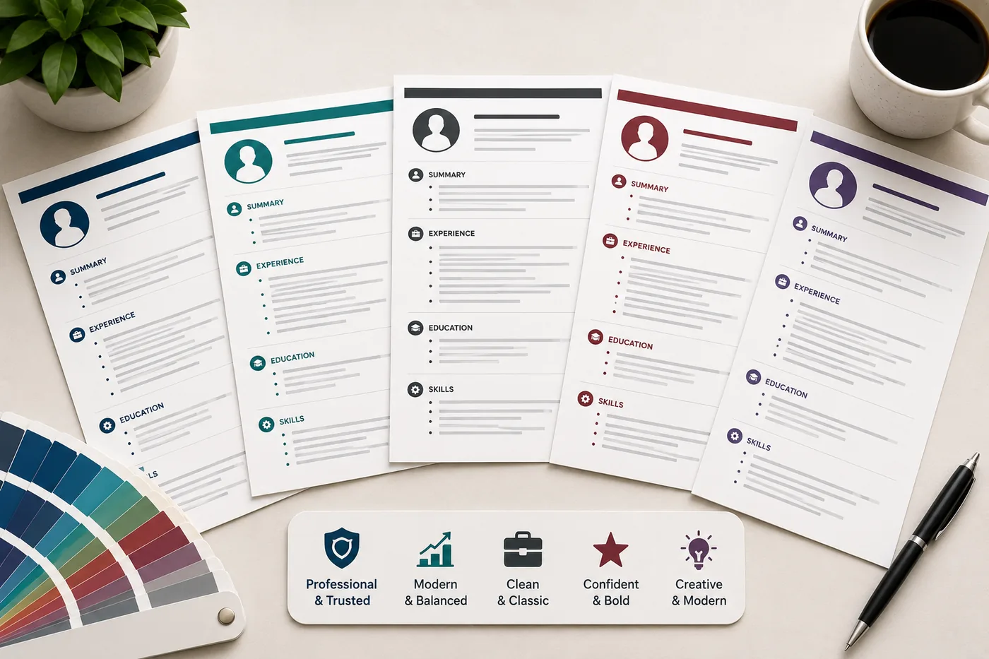
How do I choose the right resume template for my job search?
Choosing the right resume template involves considering both your industry and the specific job you are targeting. Look for templates that highlight your skills and achievements while remaining visually appealing yet professional. Our post on how to choose the right resume template provides insights into selecting a design that aligns with your career goals.