 SS
SS
Your choice of font affects how professional your resume looks, how easy it is to read, and - critically - whether an Applicant Tracking System (ATS) can parse it correctly. Most candidates spend hours on resume content and seconds on typography. This guide fixes that.
After choosing your font, start from an ATS-friendly template that already uses optimal typography, and run your resume through the TailorCV ATS score checker to confirm it parses cleanly.
Key Takeaways
- Font choice significantly impacts readability, professionalism, and ATS compatibility of your resume.
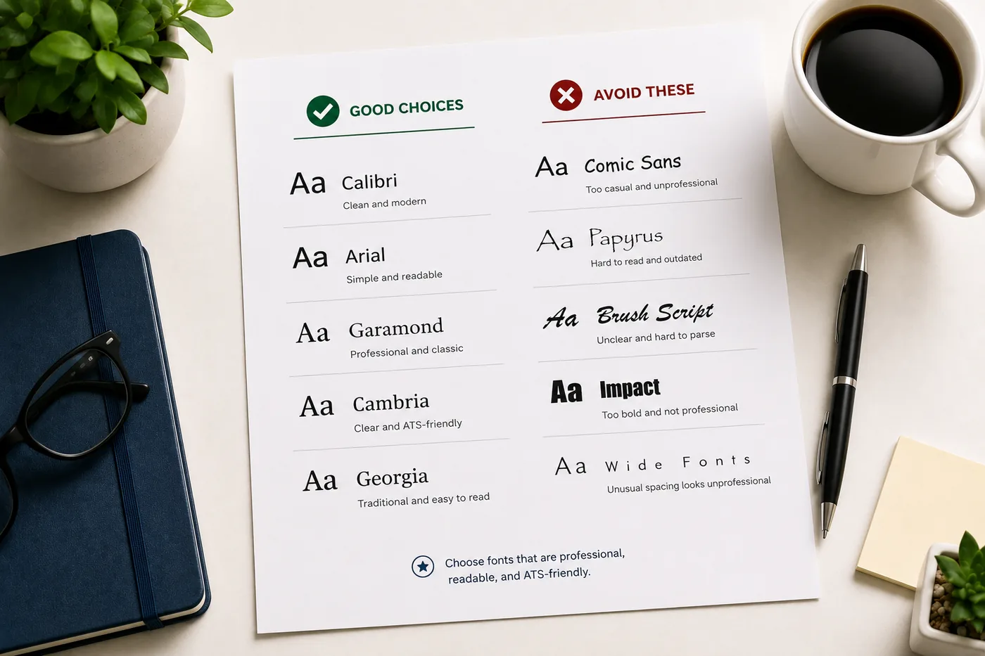
- Recommended fonts for 2026 include Calibri, Garamond, Georgia, Arial, Cambria, Lato, and Helvetica for their clarity and ATS support.
- Avoid using fonts like Comic Sans, Papyrus, and script styles, as they hinder readability and ATS parsing.
- Times New Roman and Verdana are acceptable but not ideal; consider more modern alternatives for a contemporary feel.
Why Font Choice Matters
Readability
A recruiter spending under 10 seconds on your resume needs to scan it instantly. Difficult-to-read fonts slow them down and reduce the chances they absorb your key points.
Professionalism
Some fonts signal "modern professional." Others signal "default Word document." A few signal "I don't care about details." The font you choose communicates something about your judgment.
ATS Compatibility
Some decorative, script, or unusual fonts do not render correctly in ATS software. Characters may be misread or lost entirely, corrupting your resume's data in the ATS database. Stick to standard, widely supported fonts.
The Best Resume Fonts for 2026
Top Tier - Highly Recommended
Calibri - Clean, modern, professional - Microsoft's default since 2007 - universally supported - Excellent ATS compatibility - Slightly informal but works for almost all industries - Body text: 10-11pt
Garamond - Elegant, classic, excellent readability - Great for business, finance, law, consulting - Slightly smaller at same point size - use 11-12pt for body - Strong ATS compatibility
Georgia - Serif font with excellent digital readability - Works well on screen and in print - Good for finance, consulting, legal - Body text: 10-11pt
Arial - Clean, sans-serif, highly legible - Universally supported, excellent ATS compatibility - Works for tech, healthcare, corporate roles - Body text: 10-11pt
Cambria - Traditional serif, professional - Designed for on-screen readability - Works well for conservative industries (finance, law, government) - Body text: 10-11pt
Lato - Modern, clean, popular in tech and startup environments - Google Font - not universally pre-installed but widely supported - Body text: 10-11pt
Helvetica - Design-world standard, highly professional - Commonly used in design, marketing, architecture - May not be available on all systems - use Arial as a fallback
Acceptable But Not Ideal
Times New Roman - Still readable and ATS-safe - Often associated with academic papers rather than modern resumes - Use Garamond or Georgia instead for a more contemporary feel
Verdana - Very readable but takes more horizontal space than other fonts - Works but may make your resume feel wide
Worst Fonts for a Resume
Comic Sans - Never use on a resume. Full stop.
Papyrus, Curlz, Bradley Hand - Decorative fonts that are nearly impossible to read professionally and fail ATS
Impact - Designed for headlines and memes, not professional documents
Script and cursive fonts - Beautiful visually, but ATS cannot reliably parse many script fonts - Recruiters cannot read cursive quickly
Very thin or very heavy weight fonts - Extreme font weights reduce readability at small sizes
Resume Font Sizes: The Rules
| Element | Recommended Size |
|---|---|
| Your name | 18-24pt |
| Section headers | 12-14pt (or same as body, bold) |
| Job title | 11-12pt (bold) |
| Body text | 10-11pt |
| Minimum readable size | 10pt (never below) |
Do not go below 10pt to squeeze content onto one page. It signals poor editing judgment and makes your resume harder to read. If content doesn't fit, cut it - read the ideal resume length guide for what to remove.
One Font vs Multiple Fonts
Use one font family throughout your resume.
Multiple fonts on a single resume look cluttered and amateur. Instead, use font weight (bold), size, and italics to create hierarchy within one font.
Example hierarchy using Calibri: - Name: Calibri Bold 20pt - Section headers: Calibri Bold 12pt - Job title: Calibri Bold 11pt - Company and dates: Calibri Regular 11pt - Bullet text: Calibri Regular 10pt
This creates clear visual hierarchy with zero font switching.
Serif vs Sans-Serif: Which Is Better for Resumes?
Both work. The choice is partially industry-driven:
| Industry Type | Recommended Style |
|---|---|
| Finance, Law, Consulting, Government | Serif (Garamond, Georgia, Cambria) |
| Tech, Startups, Marketing, Design | Sans-serif (Calibri, Arial, Lato) |
| Healthcare, Education | Either - keep it clean |
| Creative/Design | Modern sans-serif or carefully chosen display font |
The most important thing is consistency and readability, not the serif vs sans-serif debate.
ATS Font Safety: What to Know
ATS systems convert your PDF to text. Some fonts introduce special characters or unusual encodings that cause words to be misread. Stick to widely used, standard fonts to avoid this.
ATS-safe fonts: Calibri, Arial, Garamond, Georgia, Cambria, Helvetica, Times New Roman, Verdana
Risky for ATS: Script fonts, decorative fonts, any non-standard font you downloaded from a font website
After formatting your resume, run it through the TailorCV ATS checker to verify no parsing errors occurred from your font choices. Also read ATS resume formatting mistakes to catch other common issues.
Font Best Practices Summary
- Use one font family throughout
- Keep body text at 10-11pt minimum
- Your name can be 18-24pt
- Use bold and size for hierarchy, not multiple fonts
- Stick to standard fonts: Calibri, Arial, Garamond, Georgia, Cambria
- Avoid decorative, script, and novelty fonts entirely
- Test your PDF export - some fonts embed oddly
Related Guides
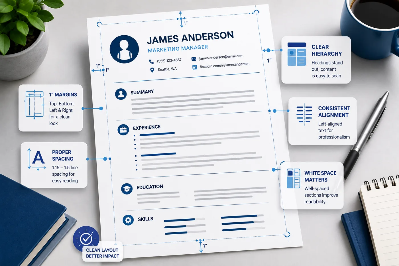
- Resume Margins, Spacing and Layout
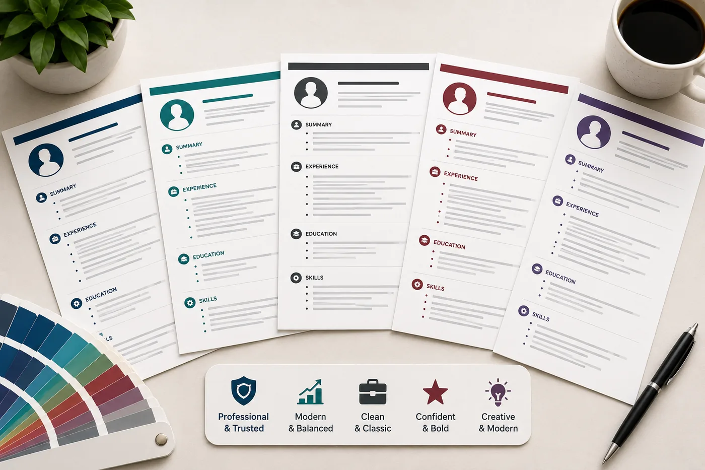
- Resume Design and Color Guide
- How Recruiters Read Resumes in Under 10 Seconds
- ATS Resume Formatting Mistakes
- How to Make Your Resume ATS-Friendly
- Ideal Resume Length Guide
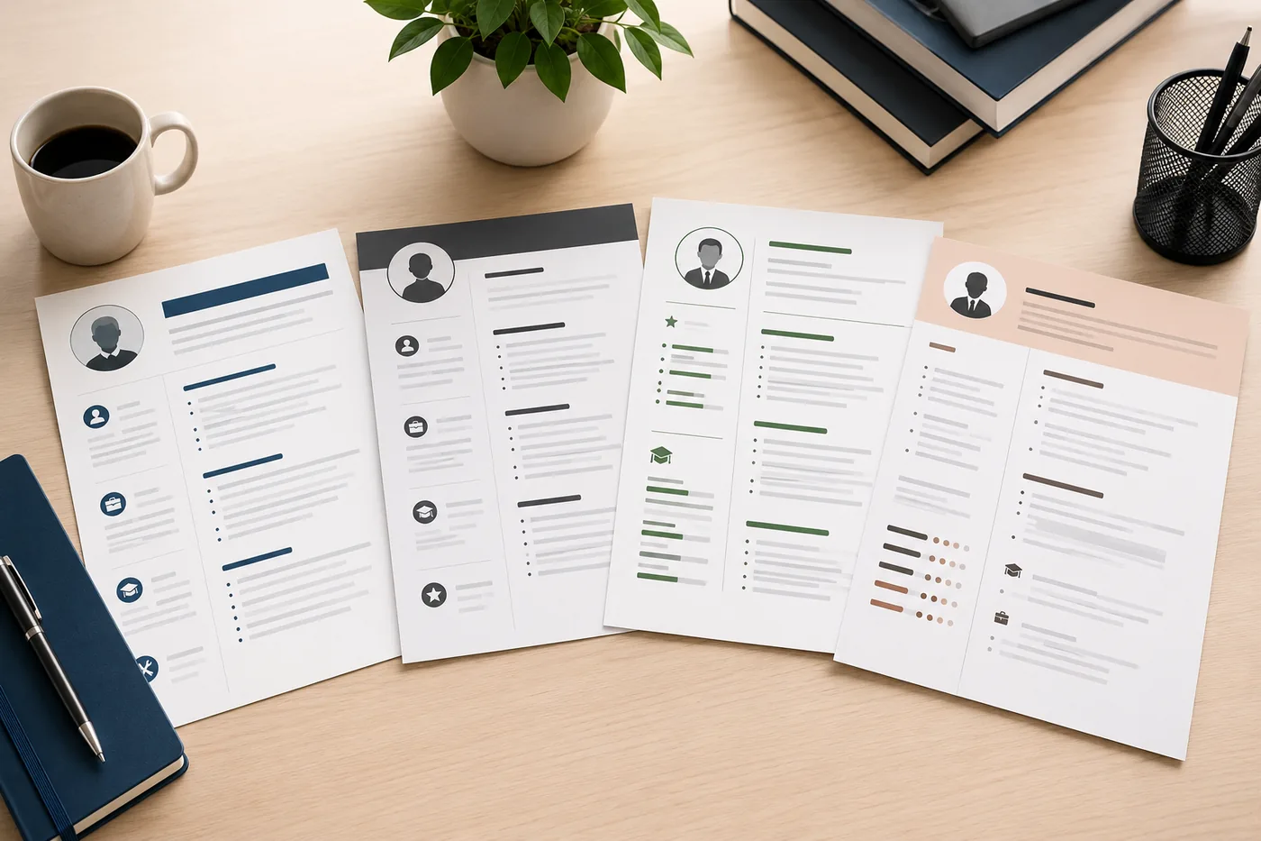
- How to Choose the Right Resume Template
- The Anatomy of a Perfect Resume
- Resume File Format Guide: PDF vs Word
Make This Practical
Use this guide as part of a complete job-search workflow. Check your resume with the free ATS score checker, improve targeting with the Resume Optimization Guide, and choose a clean format from the ATS-friendly resume templates.
After the resume is ready, strengthen the rest of the application. Draft a targeted letter with the AI cover letter generator, practice interviews with the AI mock interview tool, and create a project-backed proof page with the portfolio website builder if you need a stronger online presence.
Conclusion
The best fonts for resumes in 2026 are Calibri, Garamond, Georgia, Arial, and Cambria. Use one font family, keep body text at 10-11pt, name at 18-24pt, and create hierarchy with bold and size - not multiple typefaces. Avoid decorative fonts entirely.
Start from an ATS-friendly template that uses optimal typography out of the box, and verify your resume parses correctly with the TailorCV ATS checker.
Frequently Asked Questions
What are the best resume fonts for 2026?
The best resume fonts for 2026 include Calibri, Arial, and Times New Roman. These fonts are clean, professional, and widely supported by Applicant Tracking Systems (ATS). Choosing a professional font for your resume not only enhances readability but also reflects your attention to detail.
How do I ensure my resume is ATS-compatible?
To ensure your resume is ATS-compatible, use standard fonts like Calibri or Arial and avoid decorative or script fonts. Additionally, you should start from an ATS-friendly template and run your resume through the free ATS score checker to confirm it parses correctly.
What font size should I use for my resume?
A font size between 10 and 12 points is recommended for the body text of your resume, ensuring readability without sacrificing space. For headings, you can use slightly larger sizes, such as 14 to 16 points, to help them stand out. To learn more about optimal formatting, check out our guide on resume margins, spacing, and layout.
Are there fonts I should avoid for my resume?
Yes, you should avoid fonts like Comic Sans, Papyrus, or any overly decorative fonts, as they can appear unprofessional and may not be read correctly by ATS software. Stick to clean, modern fonts that convey professionalism. For a deeper understanding of what makes a good resume font, refer to our post on resume design and color.
How can font choice impact my resume's readability?
Font choice significantly impacts readability, especially since recruiters spend only a few seconds on initial scans. Fonts that are too ornate or difficult to read can hinder the absorption of key information. For tips on enhancing your resume’s overall structure, explore our guide on the anatomy of a perfect resume.