 TD
TD
Key Takeaways
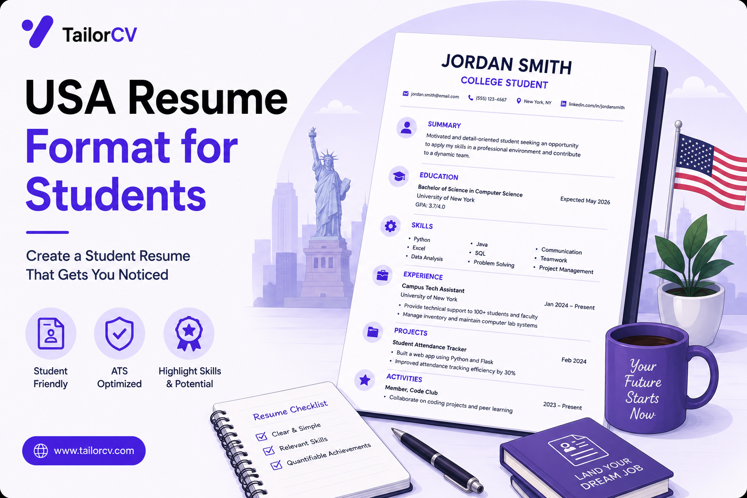
- A US student resume is one page, reverse chronological, and contains no photo, date of birth, marital status or nationality.
- "Resume" and "CV" are not interchangeable in the US — a CV means an academic document and is used for research and faculty roles.
- Including personal details is not just unnecessary; it creates a legal problem for the employer, which is why some discard those resumes.
- Bullets are judged on outcome, not duty. The same fact written two ways screens completely differently.
- Formatting choices that look elegant — columns, tables, text boxes, headers — are the most common cause of a resume parsing badly.
The hard rules
These are conventions rather than laws, but they are near-universal in US campus hiring.
One page. For a student or recent graduate this is expected, not a suggestion. Two pages signals either padding or an inability to prioritise. The exception is genuinely research-heavy academic applications.
Reverse chronological. Most recent first, in every section. Functional resumes that hide dates are read as concealment.
No photograph. This is the difference that catches most international students. In much of Europe, Asia and Latin America a photo is standard. In the US it is a problem.
No personal details. No date of birth, marital status, gender, nationality, religion, or number of dependents.
Why the photo rule is stricter than it looks
This is not an aesthetic preference. US employers operate under anti-discrimination rules, and a resume showing your age, gender, race or national origin creates evidence risk in a hiring dispute.
Some companies have formal policies of discarding resumes containing photos, precisely so they cannot be accused of having considered protected characteristics. Others strip them before the hiring manager sees them.
So a photo does not merely fail to help. In some pipelines it removes you before anyone reads a word. If you are adapting a resume from another country, deleting the photo and personal details block is the first edit to make.
Section order that works
For a student with limited work experience:
- Name and contact — email, phone, LinkedIn, GitHub or portfolio if relevant. No full postal address; city and state is enough.
- Education — while you are a student or within a year or two of graduating, this goes above experience. After that it moves down.
- Experience — internships, part-time work, research, significant volunteering.
- Projects — for technical fields this often carries more weight than the jobs.
- Skills — concrete, named technologies. Not "hard-working" or "team player".
Once you have two or three years of full-time work, education drops below experience. Until then, it is your primary credential.
What goes in education
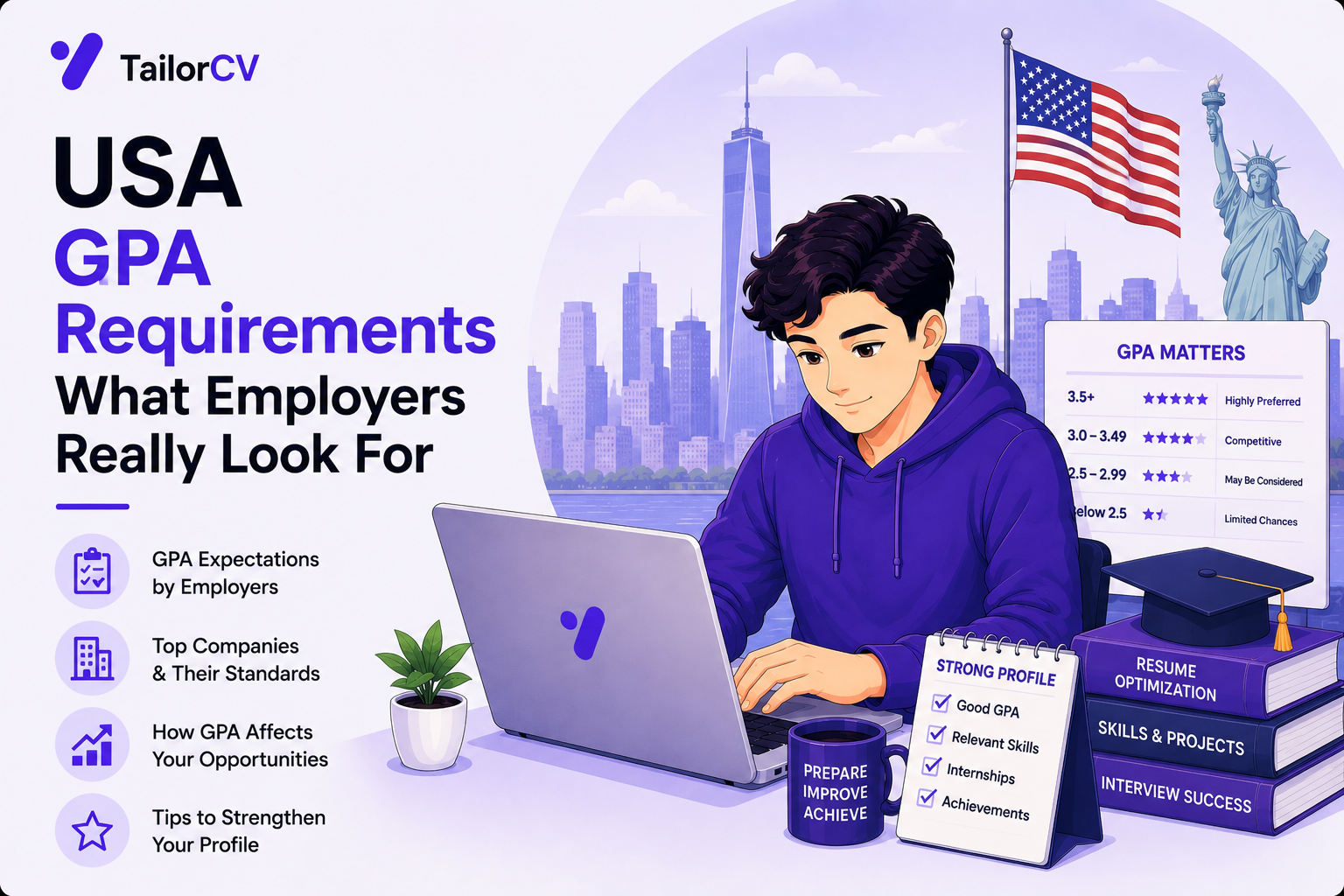
Degree, institution, graduation date (actual or expected). GPA if it is strong — the convention is to include it above roughly 3.0-3.5 and omit it otherwise. Relevant coursework is acceptable for a student with little experience, but it is weak evidence and should never displace a project.
Do not include your high school once you are in university.
Writing bullets that survive the screen
The single largest quality gap in student resumes is bullets describing duties instead of outcomes.
Compare:
Responsible for maintaining the department's inventory spreadsheet.
with:
Rebuilt the department's inventory tracking in Excel, cutting the weekly reconciliation from three hours to twenty minutes.
Same job. The second states what changed and by how much. The first states that you existed.
The pattern that works: strong verb → what you actually did → the technology or method → the result. Not every bullet will have a number, and inventing one is worse than not having it. But most student work has a scale, a frequency or a count available if you look — how many users, how many records, how many hours saved, how many people affected.
Avoid: "responsible for", "helped with", "worked on", "assisted in", "duties included". These describe proximity to work rather than performance of it. Stopping your resume sounding generic is largely about eliminating this pattern.
Formatting that parses
Almost every US employer of scale screens resumes through software before a human sees them. The document must survive being read by a machine.
What breaks parsing:
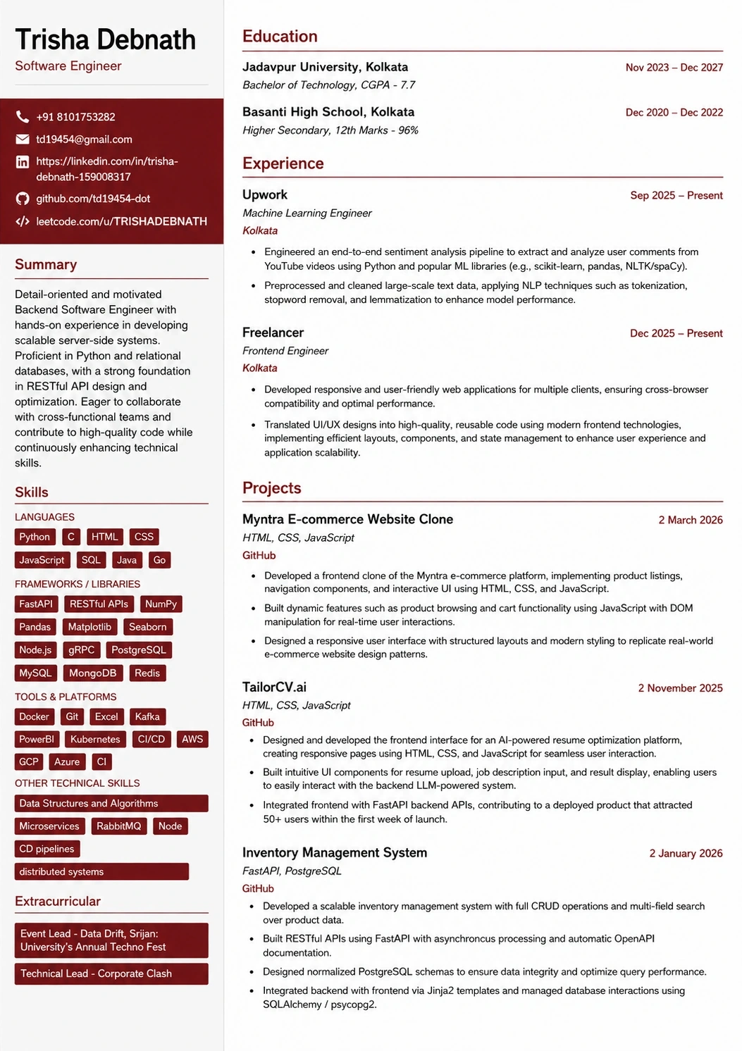
- Multi-column layouts. The parser reads across, mixing your job title with your skills list.
- Tables used for layout. Cell contents get flattened unpredictably.
- Text boxes and graphics. Frequently ignored entirely — text inside them can vanish.
- Headers and footers. Often stripped. Putting your contact details there means losing them.
- Icons instead of labels. A phone glyph does not parse as "phone".
- Uncommon fonts that may not embed correctly.
What works: a single column, standard section headings ("Experience", "Education", "Skills"), a common font, and a PDF exported from a word processor rather than scanned or image-based.
The reliable test is mechanical: export your PDF, select all the text, copy it, paste it into a plain text file. That is roughly what the parser sees. If your job titles are jumbled with your skills, or your contact details are missing, fix the layout before you fix the wording. A free ATS score check does the same job more thoroughly, including whether the keywords the posting asks for actually appear.
Formatting for the parser is separate from matching the posting's keywords — you need both, and the format problem is the one people miss because the document looks fine on screen.
Resume vs CV in American usage
In the US these are different documents.
Resume — one to two pages, targeted, used for essentially all industry roles.
CV — long, comprehensive, listing publications, conference presentations, teaching, grants and references. Used for academic positions, research roles, and some medical and scientific work.
If a US employer asks for a resume and receives a six-page CV listing every course you have taken, it reads as not understanding the market. If a research programme asks for a CV and receives a one-page resume, it reads as thin. Ask which they mean if a posting is ambiguous, particularly at universities where both are used.
Adapting a resume from another country
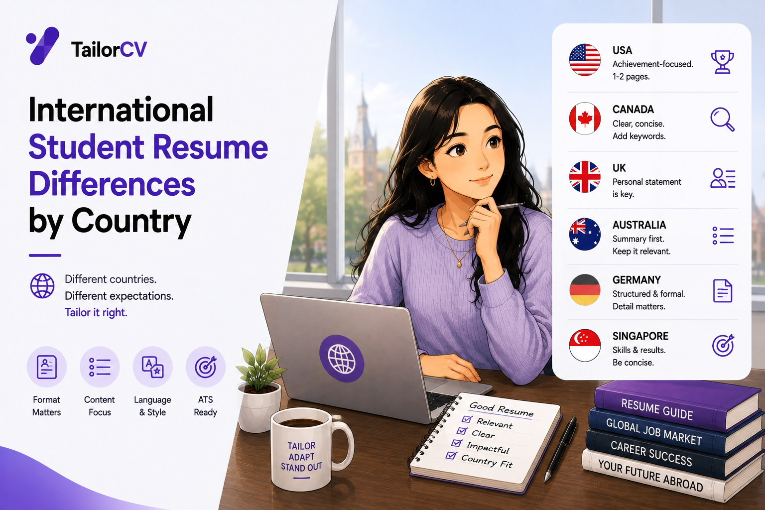
The most common edits when converting a European, Indian or East Asian resume for US applications:
- Delete the photo.
- Delete date of birth, marital status, gender, nationality, passport details, father's name.
- Delete the full postal address; keep city and state.
- Cut to one page.
- Replace "Curriculum Vitae" as a title — a US resume needs no title at all beyond your name.
- Remove references and "references available on request", which is assumed and wastes a line.
- Convert grades to a recognisable format, or state the scale. "First Class" and "8.4 CGPA" mean nothing to most US screeners without context.
- Remove declaration statements and signatures, which are a convention in some countries and read as odd in the US.
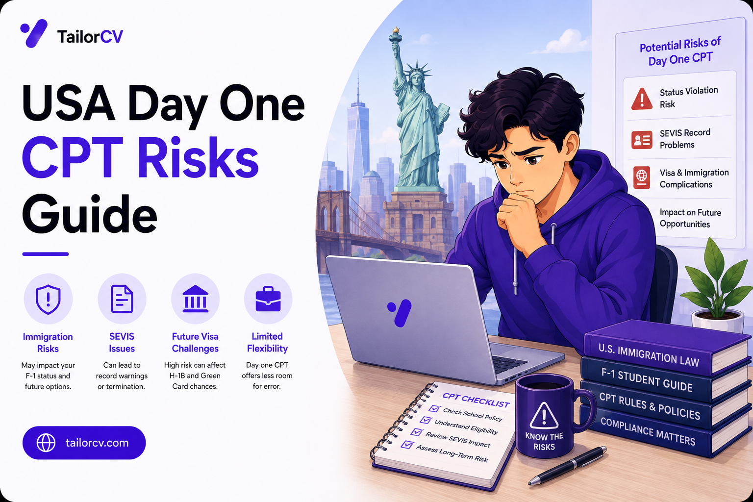
For international students, none of this touches work authorisation — visa status does not belong on the resume at all. It comes up later in the process, and putting it on the document takes space from evidence while volunteering information the screen does not need.
Writing bullets that survive a six-second read
Recruiters do not read student resumes, they scan them. The realistic attention on a first pass is a few seconds, and what survives that pass is the first half of each bullet.
Three properties separate bullets that work from bullets that do not.
The outcome comes early. Compare "Worked with a team of four to build a Python script that automated report generation, reducing manual work by six hours weekly" with "Cut six hours of weekly manual reporting by automating it in Python, working with a team of four." Identical facts. The second front-loads the thing a recruiter cares about, and it survives being cut off halfway.
The verb is specific. "Worked on", "helped with", "was responsible for" and "assisted in" describe proximity to work rather than work itself. Built, designed, automated, migrated, diagnosed, cut, shipped and consolidated describe what you actually did.
A number appears where one honestly exists. Not invented, found. Students consistently underestimate how many numbers their work contains: how many users, how many records, how many hours, how many people, how much faster, how many times a week. If you genuinely have none, a specific named outcome works instead.
The test to apply to each bullet: could someone else in your class have written this exact sentence? If the answer is yes, it is describing a category of work rather than your work.
What to do when the page is too full
The one-page constraint forces decisions, and students usually make them badly, shrinking margins and font size until the page is technically full and practically unreadable.
Cut in this order:
Anything before university. School achievements, unless genuinely exceptional and recent.
Coursework lists. A recruiter assumes a computer science graduate took data structures. The line buys nothing.
Skills nobody screens for. Microsoft Office, email, "communication". These occupy space and signal padding.
Duplicate evidence. Three bullets on the same project doing similar things. Keep the strongest.
The objective statement, if you still have one. It is a sentence explaining that you would like a job, addressed to someone reading your job application.
What to protect: projects with outcomes, internships, anything with a number, and anything the posting explicitly asks for.
If it still does not fit, the honest answer is usually that two projects are described at length where one strong one and one line would serve better.
Formatting that survives the parser
Design and parseability pull against each other, and students routinely pick the wrong side because the resume they can see looks better than the one the machine reads.
Safe: single column, standard section headings, a common font, plain bullet characters, consistent date formats, and contact details in the body of the document rather than in the header.
Unsafe: two columns, sidebars, tables, text boxes, icons in place of labels, headers and footers containing anything important, graphics representing skill levels, and any template that arranges content visually rather than sequentially.
The five-second check: open your PDF, select all, copy, and paste into a plain text file. That is approximately what the parser sees. If your job titles have merged with your skills list, or your phone number has vanished, the layout is the problem rather than the wording. A free ATS check does the same job more thoroughly.
Projects, written properly
For a student with no full-time experience, projects carry the resume. Most students write them in a way that wastes the opportunity.
The common failure is describing what the project is rather than what you did and found:
Weak: "Built a movie recommendation system using Python and collaborative filtering."
That tells a reader the category of thing you made and nothing else. Every applicant with the same coursework has the same line.
Better: "Built a recommendation engine over 100k MovieLens ratings; switching from user-based to item-based collaborative filtering cut cold-start error by roughly a third and dropped inference time under 200ms."
Same project. The second version demonstrates that you measured something, made a decision, and understood the trade-off. That is what a technical interviewer wants to talk about, and it gives them an obvious opening question.
Three questions to interrogate each project bullet with:
What decision did you make? Every real project involves a choice between approaches. Naming yours shows judgement rather than instruction-following.
What did you measure? Scale, accuracy, latency, cost, time saved. Numbers you actually observed, not invented.
What broke, and what did you do? The debugging story is frequently the most interesting thing about a student project and it is almost never written down.
A final point that matters more than the wording: the project should exist and run. A link a hiring manager can open in thirty seconds is worth more than any sentence describing it. If it cannot be deployed, a short README with screenshots and a clear explanation of the problem does most of the same work.
Common Mistakes
- Keeping the photo. The single most damaging carry-over from non-US formats.
- Two pages as a student. Reads as an inability to prioritise, and the second page often goes unread.
- Listing duties rather than outcomes. The most common quality problem in student resumes.
- Using a designed template with columns. It looks better than it parses, and parsing comes first.
- Contact details in the header. Frequently stripped by parsers, leaving no way to reach you.
- Including references or "available on request". Assumed, and wastes space you need.
- One resume for every application. The screen matches language against the posting, and a generic document matches nothing specifically. Tailoring per role is where the interview rate actually moves.
The sections, in the order that works
For a student or recent graduate, the ordering is close to fixed, and deviating from it usually costs you.
Contact details. Name, phone, email, city, and a link that works. A GitHub or portfolio URL where relevant. Not a full postal address, not a photo, not a date of birth.
Education. Near the top while you are a student, because it is your primary credential and the thing a campus recruiter is filtering on. Institution, degree, graduation date, and GPA if it helps you.
Experience or Projects, whichever is stronger. This is the one real judgement call. If you have internships, they lead. If you have no relevant employment but have built things, projects lead. Putting a retail job above a substantial technical project because employment "counts more" is a common and costly instinct.
Skills. Concrete and named. Languages, frameworks, tools, platforms. Not "problem solving", not proficiency bars, not a wall of every technology you have ever opened.
Anything else, briefly. Leadership, awards, publications, relevant activities. One or two lines, not a section each.
Education moves below experience once you have a couple of years of full-time work. Until then it stays high.
Adapting the same content per application
You cannot write a fresh resume for forty postings, and you should not send the same one to all of them. The workable compromise is a stable base with two deliberately variable parts.
The skills line reorders. Whatever the posting names first should appear first, provided you genuinely have it. This costs thirty seconds and it is the single highest-return edit.
Two or three bullets get rephrased into the posting's vocabulary. If the role says "data pipelines" and your bullet says "ETL process", change the words, not the facts. If it says "PostgreSQL" and you wrote "Postgres", match it.
Everything else stays fixed. That makes a genuinely tailored application a ten-minute job rather than an hour, which is the difference between tailoring forty applications and tailoring four.
What this is not is inventing skills to match the posting. The words change; the facts do not. Claiming something the resume cannot evidence fails at the interview, which is a worse outcome than not being shortlisted.
Common situations and how to handle them
You changed major. Nobody cares. List the degree you are completing. There is no need to explain the earlier one unless it produced relevant coursework or projects worth including.
You have a gap. For a student this is rarely questioned. If it was a year out, working, caring for family, or dealing with illness, a one-line entry is enough. Silence invites more curiosity than a brief factual line does.
Your GPA is low. Omit it. This is unremarkable and covered in detail in GPA requirements. Use the space for evidence instead.
Your experience is all unrelated. Retail, hospitality and campus jobs still demonstrate reliability, customer handling and working under pressure. Keep them brief, one line each, and let projects carry the relevance.
You have too much for one page. Cut, do not shrink. Margins below about half an inch and fonts below ten point are visible signals of over-stuffing.
You are applying across two different fields. Two resumes. Trying to serve both from one document produces one that serves neither, and the screen is matching against a specific posting.
Your name is frequently mispronounced or you use a different name professionally.
Use whichever name you want to be called, consistently across the resume, your email and LinkedIn. Consistency matters more than which one you choose.
You are an international student. Keep visa status off the document entirely. It is not a credential, it takes space from evidence, and it is answered in conversation when asked.
Submission details that quietly matter
The document is finished. These are the things that go wrong afterwards.
Always PDF. A document file reflows on the reader's machine, and a resume that was one page on yours becomes one and a half on theirs. The only exception is when the application explicitly requires another format.
Name the file as a person. Priya_Sharma_Resume.pdf, not resume_final_v4_USE_THIS.pdf. Recruiters save these into folders, and the filename is what they see for months.
Check the PDF's own text layer. Some design tools export text as outlines or in an order that extracts wrongly. Open your PDF, select all, copy, and paste into a plain text file. What you see there is roughly what the parser sees — and if the columns interleave or the dates land in the wrong place, that is a real problem that is invisible when you look at the page. Running an ATS check does the same job more thoroughly.
Do not password-protect it, and do not add a digital signature. Both break automated processing at some employers.
Keep one master version and tailor from it. Version sprawl is how the wrong resume gets sent, and sending a document tailored to a different company is a rejection with no appeal.
Frequently Asked Questions
Should I really keep it to one page?
As a student or recent graduate, yes. The convention is strong enough that exceeding it is itself a signal. If you cannot fit, the problem is usually that you are including things that do not earn their space.
Do I include my GPA?
Include it if it is strong — commonly above 3.0, and certainly above 3.5. Omit it otherwise. Omitting is normal and does not itself raise suspicion; some employers screen on GPA and most do not.
Is a PDF or Word document better?
PDF, unless the posting explicitly asks for Word. Export from a word processor rather than printing to image, so the text remains selectable and machine-readable.
Can I put projects above work experience?
Yes, and for technical students it is often the right call. If your projects are more impressive and more relevant than your part-time retail job, lead with them.
Should I mention that I need visa sponsorship?
Not on the resume. It will be asked during the application or interview process and should be answered directly when it comes up. Volunteering it on a screened document costs you space and offers no benefit.
What about a summary or objective at the top?
An objective stating what you want is outdated and wastes the most valuable space on the page. A short summary can work if it is specific to the role and carries real evidence, but a generic one is worse than nothing.
Does your formatting survive the parser?
Upload your resume and see what an ATS actually reads back.
Drop your resume here or choose a file
PDF only. Max 2 MB.
We never share your data or use it to train AI models.
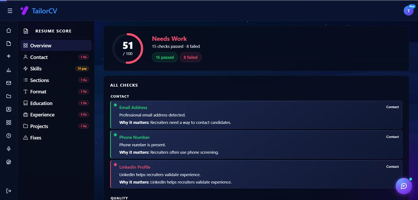
A layout that parses cleanly
Single column, standard headings, no text boxes — the formatting rules in this guide, already applied.
Was this guide useful?
Be the first to rate it.