 SS
SS
Key Takeaways
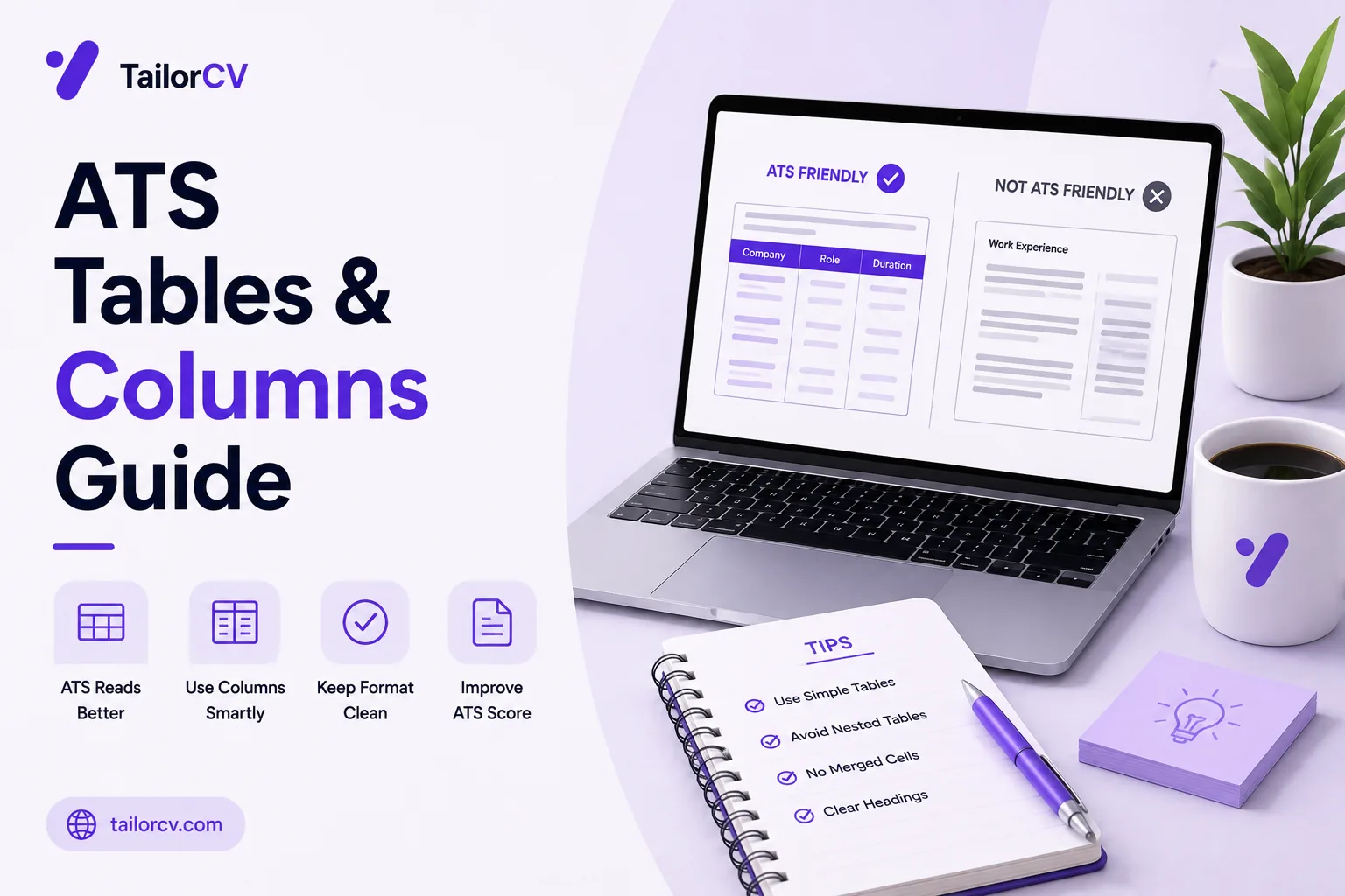
- A parser reads a page in a linear order, so two columns can interleave into unreadable text.
- Tables used for layout frequently lose their structure, scattering related information.
- The sidebar resume — skills on the left, experience on the right — is the most common offender.
- You cannot tell whether it worked by looking at the document; you have to check the extracted text.
- A single-column layout with clear headings loses nothing that matters and eliminates the risk.
Multi-column resumes are popular because they look organised and fit more onto a page. They are also the single most common cause of parsing failure, and the failure is invisible to the person who created the document.
That combination — attractive, widespread, and silently broken — makes this worth understanding properly rather than taking on faith.
This guide covers what actually goes wrong and how to check.
See what a parser extracts from your own file — the free ATS score checker.
What a parser actually does
A PDF does not store "columns". It stores text elements with positions on a page.
When a parser extracts text, it has to decide what order to read those elements in. Some parsers handle multi-column layouts well; many read across the page, line by line, from left to right.
On a two-column resume, reading across produces this:
Skills Senior Data Analyst Python, SQL Acme Corp, 2023-2026 Tableau Built the forecasting model that Excel reduced stockouts by 18%
Your name, your skills and your experience are all present, and none of it means anything. A recruiter searching for "forecasting" may still hit it, but a hiring manager reading the parsed profile sees nonsense — and any structured field extraction, like matching job titles to dates, fails.
The critical part: your document still looks perfect. You have no indication anything went wrong.
Layout risk, ranked
| Layout | Risk | What typically fails |
|---|---|---|
| Single column, standard headings | None | Nothing |
| Single column with a short two-up skills line | Low | Occasionally merges a few terms |
| Header band with contact details | Moderate | Contact details dropped entirely |
| Narrow sidebar, one section only | High | That section interleaves |
| Full-height sidebar (skills + contact) | Severe | Contact details and skills both corrupt |
| True two-column, equal width | Severe | Whole document interleaves |
| Layout table wrapping the page | Severe | Cell order lost, sections scattered |
| Nested tables | Severe | Unpredictable, frequently total loss |
| Text boxes for sections | High | Boxes skipped entirely, content vanishes |
Read this as a spectrum rather than a binary. The risk rises with how much of the page depends on horizontal position to be understood.
The sidebar resume
The most common version of this problem.
A narrow left column carrying your photo, contact details, skills and languages, with a wide right column for experience and education. Extremely popular in downloadable templates.
Why it is particularly bad: the sidebar frequently holds your contact details. If extraction scrambles or drops it, a recruiter has your experience and no way to reach you.
It is also where photos and icons cluster, which introduces the separate problem of text rendered as graphics — see ATS resume formatting mistakes.
Why these templates are everywhere
They are designed by graphic designers optimising for how a page looks in a portfolio, not for how it survives text extraction. A template marketed as modern, clean or even "ATS-friendly" is making a visual claim, not a tested technical one.
Treat the label as a claim to verify. Download it, fill it in, export it, and run the select-and-paste test below. If it passes, keep it. Plenty do not.
Tables
Tables cause a related but distinct problem.
Used for layout — an invisible table structuring your whole page — extraction may read cells in an unexpected order, or lose the relationship between them entirely.
Used for content — a genuine table of skills with proficiency ratings — the association between a skill and its rating frequently disappears, leaving a list of words and a list of numbers.
Nested tables are worse again.
What to use instead: ordinary paragraphs and bullet lists. Everything a layout table does on a resume can be done with normal text flow and spacing.
The skills-rating table, specifically
This is worth its own warning because it is so common.
What you designed — four neat rows, each skill beside its rating:
Python ●●●●○ Java ●●●○○ SQL ●●●●● Excel ●●○○○
What frequently extracts — the column of names, then the column of dots, with nothing connecting them:
Python Java SQL Excel ●●●●○ ●●●○○ ●●●●● ●●○○○
Every rating is now attached to the wrong skill, or to none. A reviewer reading the parsed version sees a list of words followed by a row of symbols.
Beyond the parsing problem, self-assigned proficiency ratings carry little weight with reviewers — four dots next to Python is your opinion, not evidence. A bullet showing what you built with Python does more work and cannot be scrambled.
How to check
You cannot tell by looking. Three ways to actually verify:
1. Select all and paste. Open your PDF, select the entire document, copy, and paste into a plain text editor. Read the result. That approximation of what a parser sees is usually enough to reveal a scrambled layout immediately.
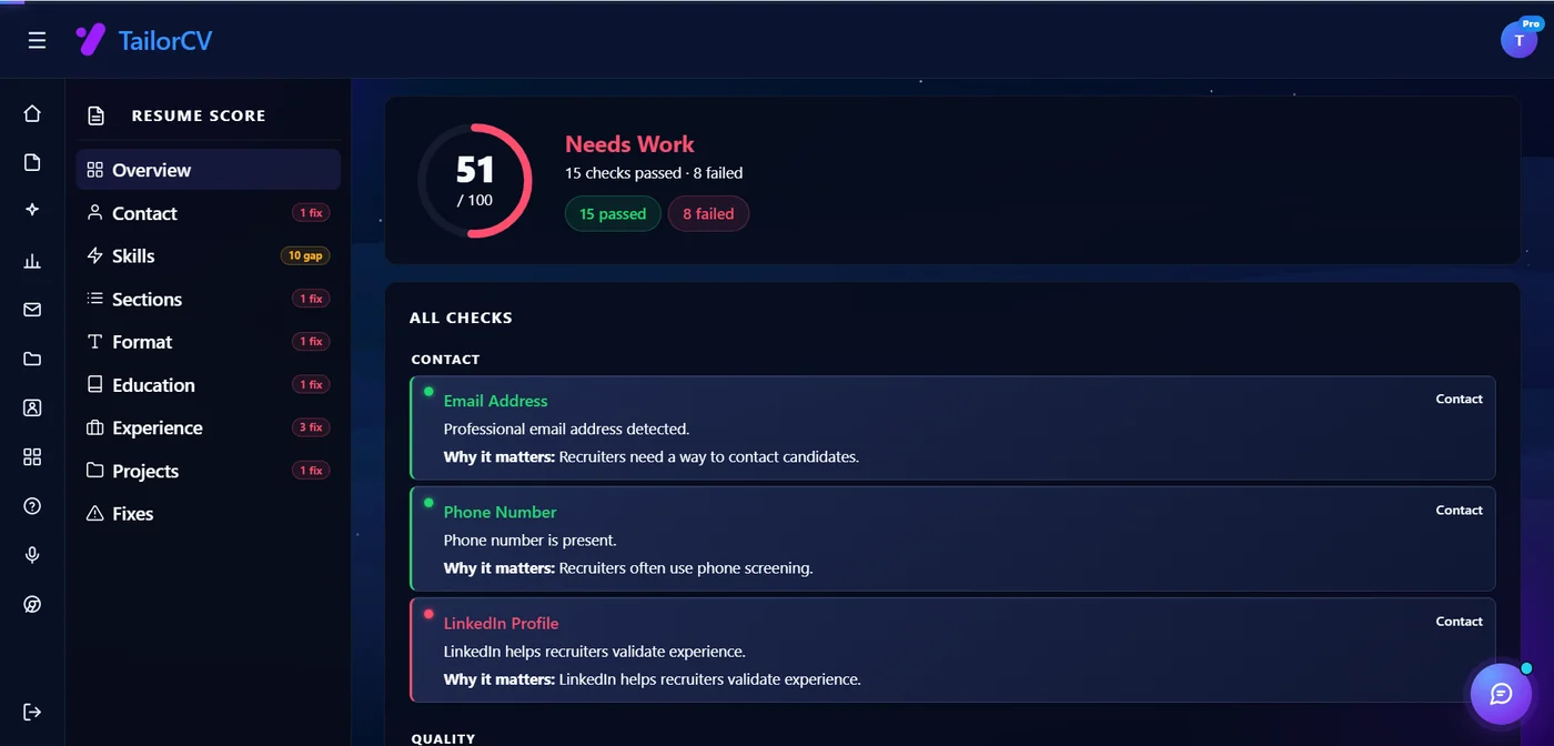
2. Run it through a parser. A scoring tool shows you the extracted fields — whether your name, contact details, titles and dates landed where they should.
3. Check the field mapping specifically. Did your phone number extract? Your job titles? Your dates? Missing fields point directly at the layout element that swallowed them.
Do this once per template. If you change resume design, check again. If nothing pastes at all, the problem is a missing text layer rather than your layout — see the file format guide.
What to use instead
Single column, full width. Everything in one flow, top to bottom.
Standard headings — Experience, Education, Skills, Projects — so a parser can categorise sections.
Bullet points for lists. Entirely safe and easier to read.
Bold and italics are fine, and always were.
White space and spacing for visual separation, rather than table borders or column rules.
Contact details in the body, at the top — never in a header or a sidebar.
What you lose: slightly less content per page. What you gain: a document that survives extraction. For a resume, that trade is not close.
Getting visual interest without columns
The usual objection to single column is that it looks plain. It does not have to.
| Instead of | Use |
|---|---|
| A coloured sidebar | A coloured heading rule or section underline |
| Two-column skills | One line of comma-separated skills, grouped by type |
| A table of contact details | One centred line under your name |
| Icons for phone and email | The words, which are searchable anyway |
| A rating-bar graphic | A bullet showing what you built |
| Boxed callouts | Bold lead-ins at the start of a bullet |
Every option on the right survives extraction intact, and several read better on paper than the version they replace.
When two columns are acceptable
Narrow cases, and they require verification.
If you have verified extraction works for your specific document with your specific parser, and you are applying somewhere you know reviews resumes manually.
Design and creative roles where you also submit a portfolio and the resume is reviewed by a human — though even then, applications frequently pass through a system first.
A short skills line rendered as two columns of a few words is lower risk than a full-height sidebar.
The general rule stands: if you cannot verify it, do not risk it. The cost of being invisible is total, and the benefit of the layout is aesthetic.
One practical compromise for design roles: keep a single-column version for applications submitted through a portal, and a designed version to attach or link when you are emailing a human directly. The content is identical; only the presentation differs, and each version goes where it works.
Common Mistakes
Assuming it looks fine so it parses fine. The document appearing correct tells you nothing about extraction, and this is why the failure is so widespread.
Using a sidebar for contact details. If it is scrambled or dropped, a recruiter has your experience and no way to contact you.
Using tables for layout. Cell order and relationships are frequently lost, scattering related information.
Putting skills and proficiency ratings in a table. The association between them typically disappears entirely.
Never doing the select-all-and-paste check. It takes thirty seconds and reveals the problem immediately.
Changing template without re-checking. Each design has its own extraction behaviour.
Prioritising content density over readability. Fitting more on a page is worthless if the page cannot be read by the system.
Trusting a template because it is marketed as ATS-friendly. Verify it yourself rather than taking the claim on faith.
Using text boxes to position sections. They are frequently skipped whole, so entire sections vanish silently.
Assuming a plain single column has to look boring. Heading rules, bold lead-ins and good spacing do the same visual work safely.
Frequently Asked Questions
Are two-column resumes bad for ATS?
They are the most common cause of parsing failure. Some parsers handle them; many read across the page and interleave your columns into unreadable text.
Why are tables a problem?
Layout tables can be read in unexpected cell order, and content tables frequently lose the association between related cells — a skill and its rating, for instance.
How do I know if my layout parses correctly?
Select all the text in your PDF, copy it, and paste into a plain text editor. If the result is scrambled or interleaved, so is what the parser sees.
What is wrong with a sidebar?
It usually carries your contact details, and losing those means a recruiter has your experience with no way to reach you.
Can I use bullet points?
Yes. Bullets, bold and italics are all safe. The problems come from tables, text boxes, columns and text inside images.
Are templates advertised as ATS-friendly reliable?
Not automatically. Verify by extracting the text yourself rather than trusting the description.
Are skill rating bars worth keeping?
No. They scramble on extraction and carry little weight anyway, since a self-assigned rating is an opinion rather than evidence.
Can I keep a designed version for some applications?
Yes. Use a single-column version for portal submissions and a designed version when emailing a human directly. Same content, different presentation.
Does a single-column resume have to look plain?
No. Heading rules, bold lead-ins, grouped skills lines and generous spacing give you visual structure without any positional risk.
What if I need more space?
Cut content or reduce margins rather than adding a column. A shorter readable resume beats a denser unreadable one — see the resume length guide.
Check what a parser actually extracts from your resume. Check your ATS score free.
Make This Practical
Select all the text in your resume PDF, copy it, and paste it into a plain text editor. Read what comes out — if your skills are interleaved with your job titles, that is exactly what a parser sees, and your document looking perfect told you nothing.
Then move to a single-column layout with standard headings and your contact details in the body rather than a header or sidebar. Bullets, bold and white space are all safe, so you lose almost nothing except a little content density.
Finally, re-run the check whenever you change template. Each design behaves differently under extraction, and a template marketed as ATS-friendly is a claim to verify rather than trust.
What is your resume scoring right now?
Scan it against a job description and get your ATS match score in about a minute.
Drop your resume here or choose a file
PDF only. Max 2 MB.
We never share your data or use it to train AI models.
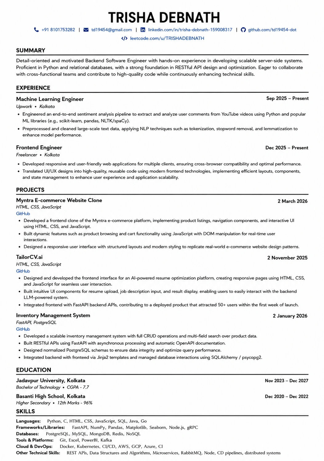
Templates that keep this structure intact
This template is ATS-tested — start from it and the formatting rules in this guide are already handled.
Was this guide useful?
Be the first to rate it.